The Four Seasons
Timeline
2 weeks
Role
UX/UI Designer
Overview
This is a concept-level project that was presented to the Vice President of Rooms at Four Seasons. Working within the strict constraints of the brand, I sought to understand how AR and Keyless Entry can improve the hotel experience.
Solution
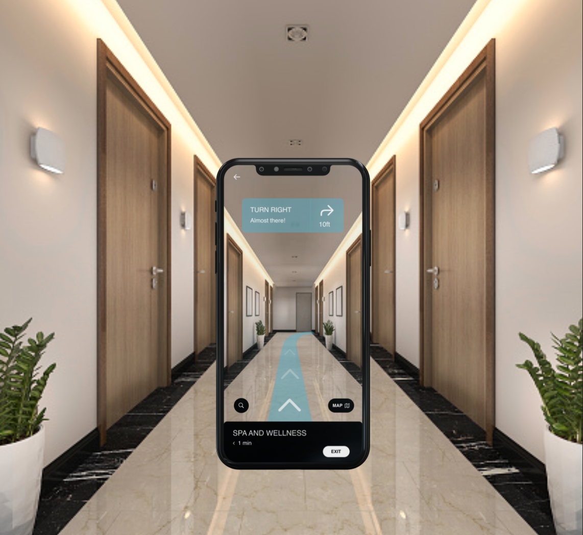
Implementing mobile key technology provides guests with the convenience of reducing time at the front desk and assists in the prevention of lost or forgotten room keys. This solution allows hotel guests to check in and access their assigned guest room immediately upon arrival, unlocking the door with their mobile device and thus eliminating the need to visit the front desk. Potential guests are also given the opportunity to view the entire hotel from a 360° perspective, allowing them to view and get directions to the rooms, gym, pool, lobby, and more.
Interview with the stakeholder
I conducted an interview with the Vice President of Rooms at Four Seasons to better understand the clientele and the goals and pain points that Four Seasons is facing.
GoalsStreamline guests needs prior and during their stay
Build loyalty and gain retention on their app
Add additional features to their current app in order to enhance their guests' stay.
ProblemsHow can we predict and integrate the guest’s itinerary without feeling too pushy or like blatant marketing?
How do we allow the user to set up their profile to queue up relevant information for their stay?
The two things Four Seasons wants to focus on for improving their app is: Mobile Key and Mobile Payment.
Ideation
I created a few lo-fi wireframes to explore a few different ideas for the mobile key landing page.
Usability testing
Using a small but diverse set of subjects I solicited feedback for proof of concept and future features and functionality.
Final design
FeaturedLanding page showcasing mobile key features while retaining Four Seasons branding.
Designed a new page called 'my stay' where users can access mobile key and 360 map
Exploration of Mobile Key, Spa & Wellness page, search results, and directions
Additional screensDuring testing, users were interested in how AR could be used through the booking process. Currently, Four Seasons does not offer booking within their app but I wanted to explore how this could be implemented. Because I designed a new page called 'my stay', this is where users would access the booking feature. This allows for a seamless transition for the user to search, book and then access their stay at Four Seasons.
Because the booking process was not within the project scope, I only designed two screens in order to investigate how this design feature would look within the app.
Reflection
I really enjoyed exploring keyless entry and AR within the hospitality industry. Apps, in particular, are increasingly important in the way hoteliers manage the services they provide to their customers and can now control many aspects of the guest cycle and experience. Features such as Virtual & Augmented Reality allow guests to use this tool to explore the hotel, access restaurant opening times, reviews or interactive tourist information maps, or even create user-generated content.
Overall, the design had a usability test completion rate of 100% (5 out of 5 participants) when navigating the prototype.


